
In the world of branding, we would call this a visual audit. A look at the competative landscape, an overview of the visual design and language in any given business category.
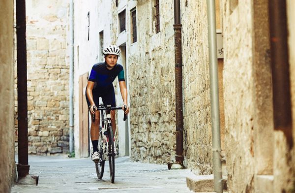
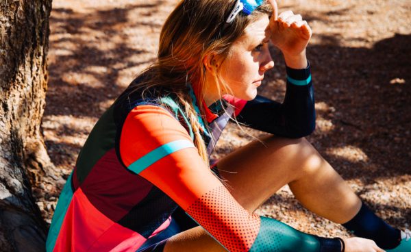
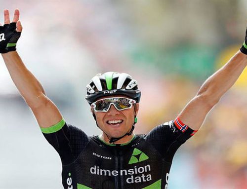
We decided to take an in-depth look at how brands advertise their apparel to women. How do they present women in imagery? Do they show women as athletes or fashion models? Are they sexy or inspirational or hard core serious? Are they posed or casual, out on the road or standing against a white background?
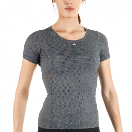
Many apparel companies don’t even have pictures of women on their websites. Photo shoots are too expensive. Look at Capo, 7 Mesh, Sugoi, Giordana, Attaquer, Nalini, POC, Garneau and you’ll find only product shots.
This illustrates the difference between product-driven apparel companies and those who are creating an actual brand that has a distinctive look and feel and voice. The perfect example would be Rapha, which laregly created the approach within the cycling apparel world.
Smart brands like Cafe du Cyclist, MAAP and Gore have followed that road map. Take a look at this audit and see what you think. Are they doing an amazing job or a mediocre one?
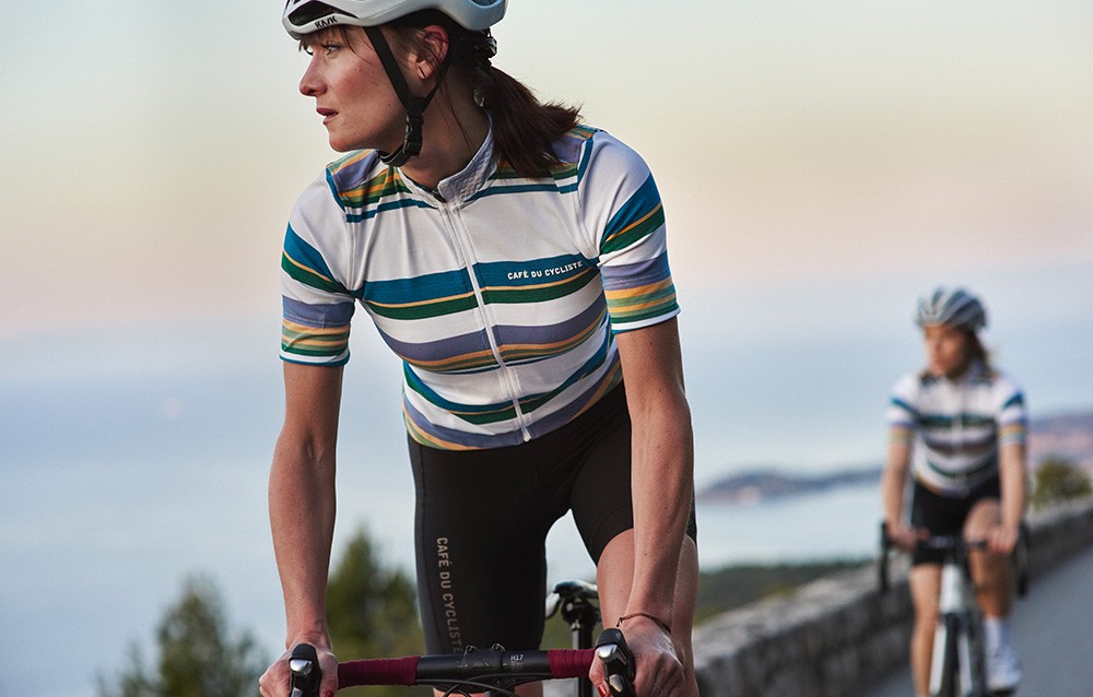
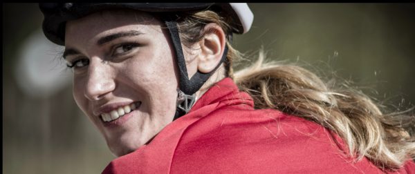
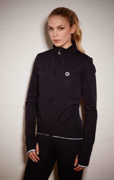
Cafe du Cycliste
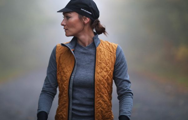
From Nice, France

Oh so beautifully French
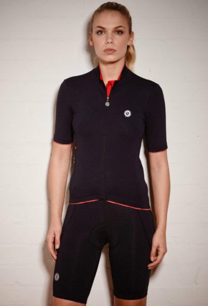
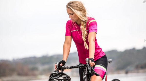
MAAP

Sexy with style
Sporty and attractive
De Marchi. Playing the retro Italian card
Italian cycling heritage
A 60’s and 70’s vibe
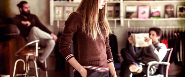
Velobici. The vibe is skinny
As in very skinny
With a touch of fashion world insolence
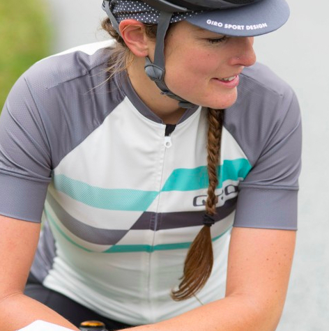
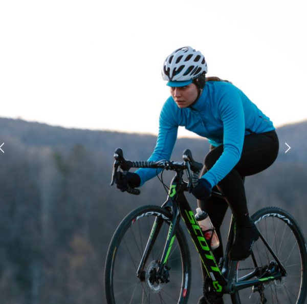
Giro. Down to earth, extremely casual
Almost too casual. Not sure this qualifies as aspirational
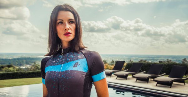
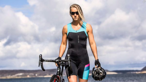
Hincapie. Unexpectedly sexy
Playing up the kit

Working the sweat as sexy
Whoa, even the off-angle shot
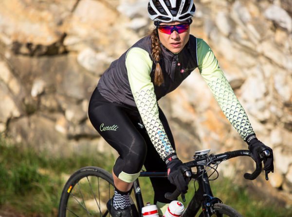
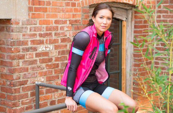
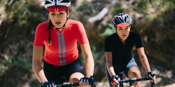
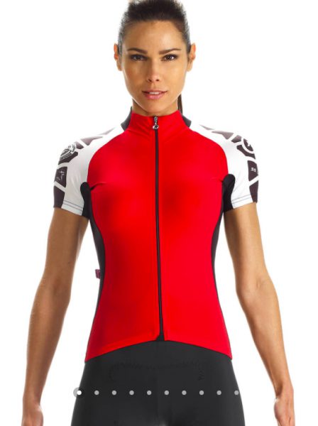
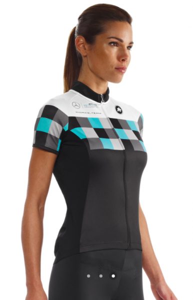
Castelli. Style with a more performance take
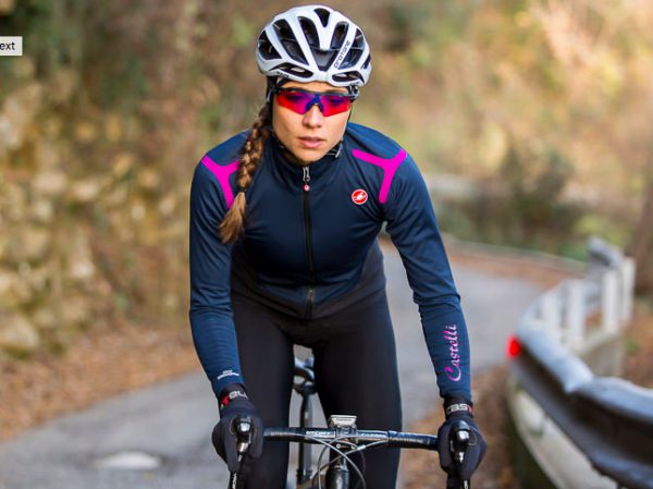
Yes, the women are beautiful but they’re putting in the mileage. After all, it’s Italian.
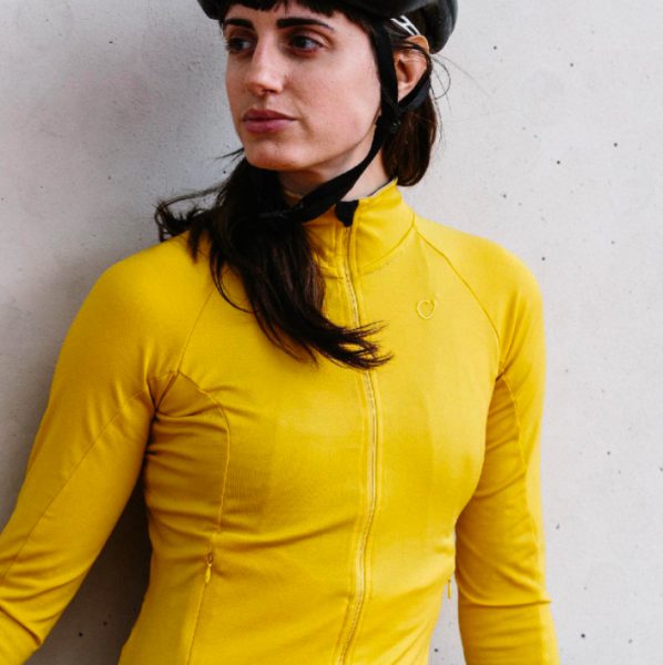
Gore. Also went fashion and sexy.
Sculptural braids
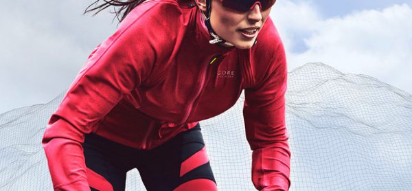
Game on in rain
Yes, I’m bad-ass

Giordana. For an Italian brand, this is just sad
Cropped heads. Stiff and posed. Very catalogue-y.
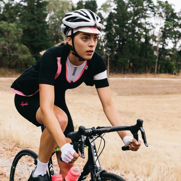
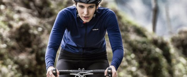
Rapha. Always a perfect balance of beauty and perspiration.
Very athletic but a touch too soft looking.
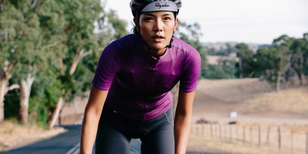
Ahh, the flipped out cycling cap. Sexy.

Pearl Izumi. Great apparel but not showcased well.
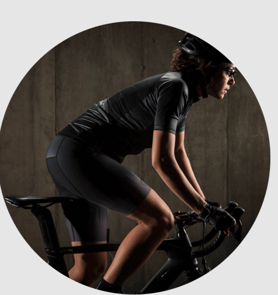
This could have been a great image but the circle wrecks it.
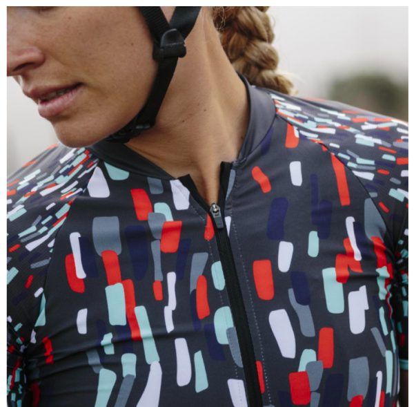
Velocio. Still looks like they’re evolving a style.
Kinda editorial, sorta interesting.
On the bike. A little salute to Rapha.
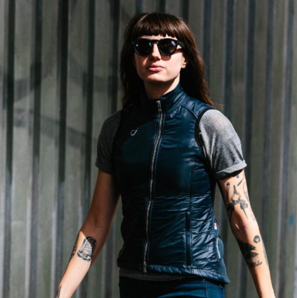
Ahh, the tats. This must be authentic, huh?
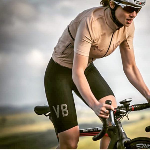
Assos. Strange, Barbi doll cyborg?
She does not ride a bike, she’s here to kill you.
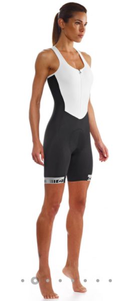
This is just disturbing. Why is she on tip-toes?
Leave A Comment