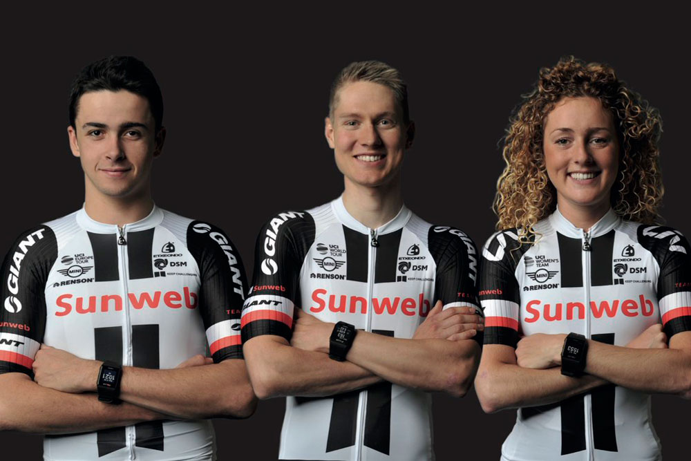
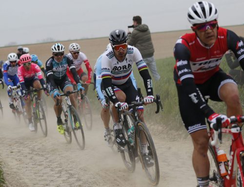
Sunweb announced their new kit for the 2017 season. It’s awful and bland and disappointing and sad. If I’m the branding agency for Sunweb or the design agency for Sunweb or whoever did the creative work on this kit, I deserve to be fired on the spot.
I’m in branding. I’ve been doing advertising and branding for almost 30 years. This kit is horrifically misguided. The black and white with two stripes looks like one of two things: a group of referees riding in the peloton or a rider in jail behind black, steel bars.
That’s not a good look, those aren’t positive associations, this doesn’t reflect well on Sunweb, a company that appears to do vacation packages to destinations all over Europe. Nothing about this kit says fun, energy, happiness — there is no vacation vibe. Instead you have black bars and monochromatic dull. As a design it works better for a sponsor of funeral services or an accounting firm.
Apparently, the manager of the Sunweb team is publicly happy with the results. That’s no surprise — who says their kit is uninspired or ugly? Being in the business of branding, I can certainly appreciate the attempt at post-rationalizing the design as something meaningful and symbolic.
And therefore you get a corporate quote like this one: “For the team and its members, the meaning of these two iconic stripes goes far beyond an appealing design on a race kit, as one rising stripe represents the continuous development of the athletes and the other represents the continuous development of the team’s science and technology driven sport environment – together they form the “Keep Challenging” strategy to which the team has been committed to as their key growth-driver from day one,” said team manager Iwan Spekenbrink.
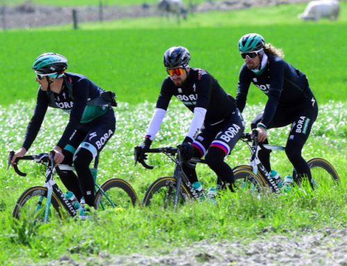
Now from comments we’ve read from several riders, Spekenbrink is a great guy and the team is certainly well-run with fantastic great riders. Noting but respect for what the former Giant Alpecin squad has accomplished but kit-size, this is just awful, a total design fall, as unimaginative as you can get.
People in branding like to make up stories about logo design and visual identities in an attempt to make the work appear strategic and intentional. That’s the game we play with clients. But saying two black lines are iconic and represent athlete development and sports science and technology is a wild stretch of the imagination. It’s a referee or a prisoner.
We wish Sunweb nothing but success and triumph for the 2017 season. However, we’ll also do our best to ignore their awful kit.
Leave A Comment